


So, let's get the party started
(Note: I believe in learning by doing, therefore in order to get max value out of this article, I suggest you to open your code-editor and copy-paste the code from article and see the magic happen)
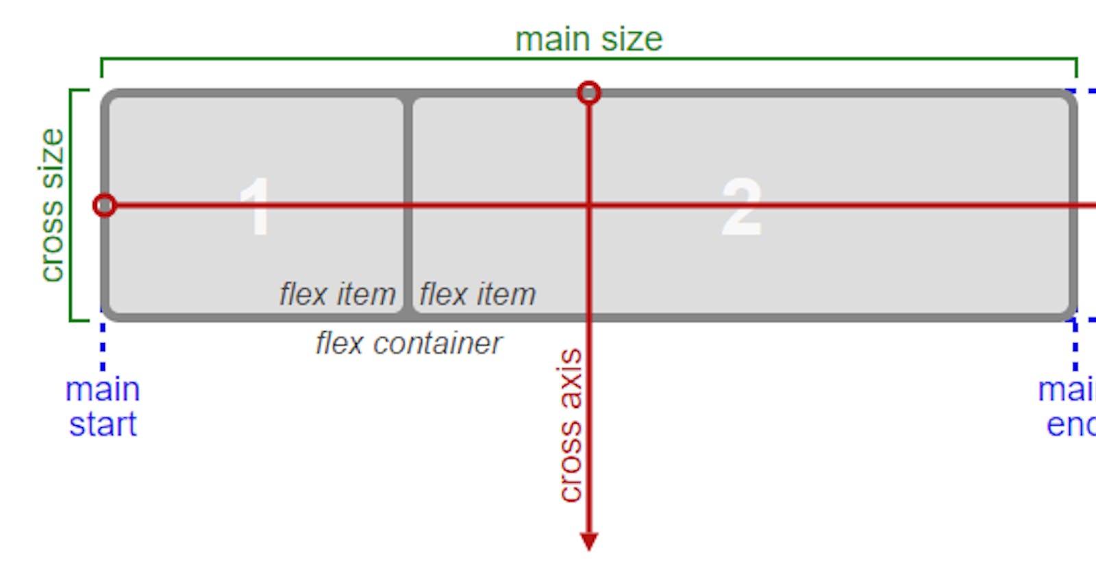
Flexbox stands for flexible box. It provides an easy and efficient way to align items in a container.
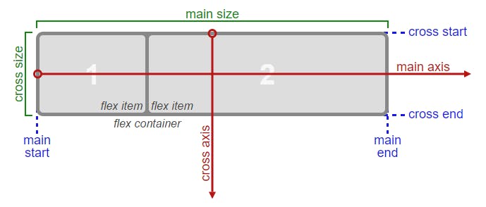
Flex items: elements that we are trying to align.
Flex container: parent container that contains these flex items.
Main axis: Axis along which we are trying to align our flex items.
Cross axis: Axis perpendicular to main axis.
To better understand we'll divide flexbox properties in 2 parts:
(1) properties that apply to flex container:
(a) flex-direction (b) flex-wrap (c) justify-content (d) align-items
(2) Properties that apply to flex items:
              (a) order
              (b) flex-grow
              (c) flex-shrink
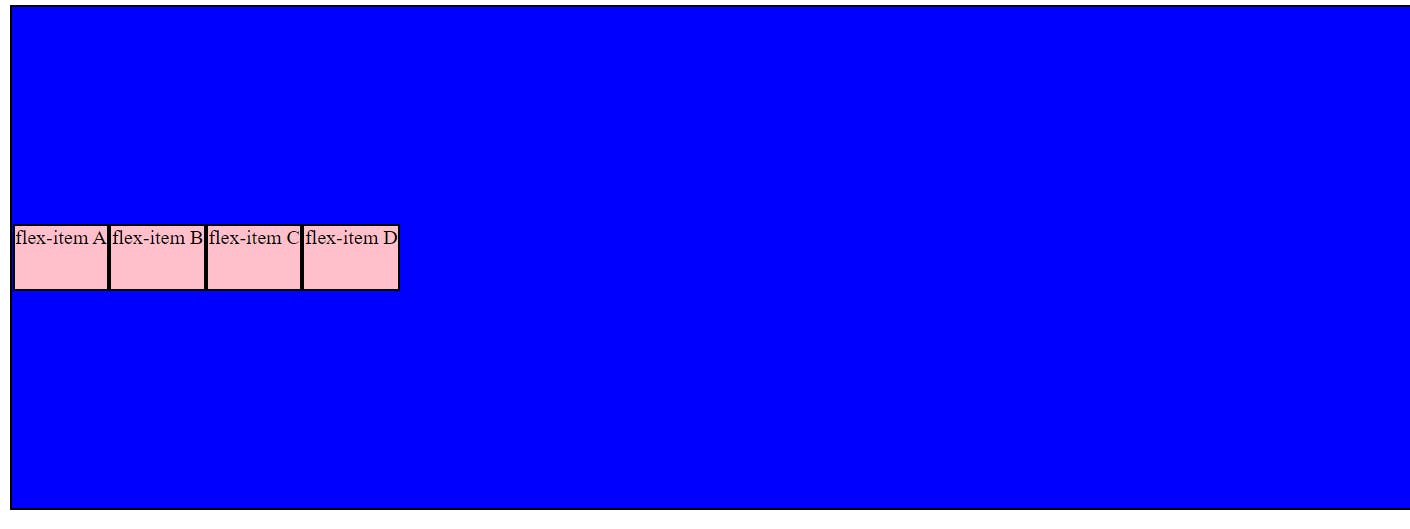
Note: In order to apply all the above properties, one has to set the "display: flex" in the parent container.
Below is the basic code on which we'll apply various properties:
<!DOCTYPE html>
<html lang="en">
<head>
    <meta charset="UTF-8">
    <meta http-equiv="X-UA-Compatible" content="IE=edge">
    <meta name="viewport" content="width=device-width, initial-scale=1.0">
    <title>Document</title>

    <style>
         div{
            background-color: blue;
            border: 2px solid black;
            height: 400px;
        }

        .child{
            background-color: pink;
            border: 2px solid black;
            height: 50px;
        }
    </style>
</head>
<body>
    <div>
        <p class="child">flex-item A</p>
        <p class="child">flex-item B</p>
        <p class="child">flex-item C</p>
        <p class="child">flex-item D</p>
    </div>
</body>
</html>
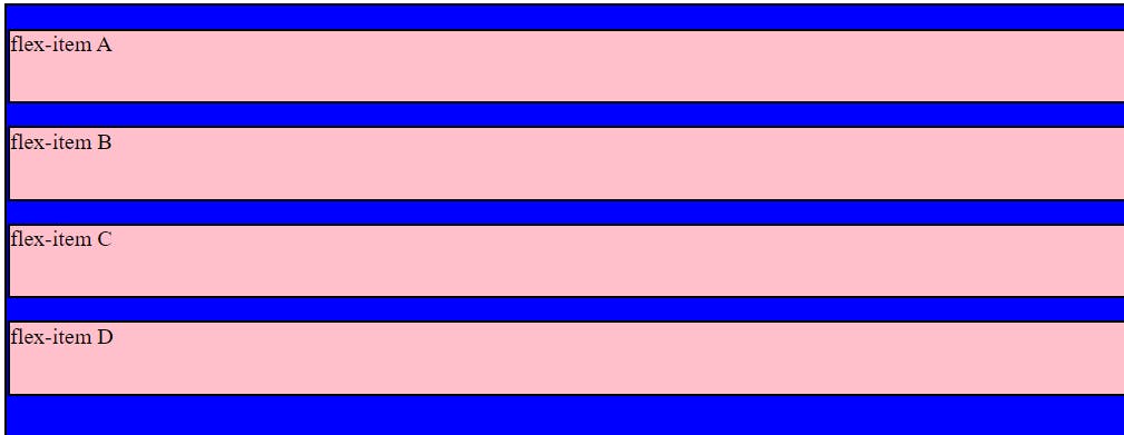
Let's understand the properties that apply on flex-container.
(1a) flex-direction:
It provides the direction in which to align the flex items.
<!DOCTYPE html>
<html lang="en">
<head>
    <meta charset="UTF-8">
    <meta http-equiv="X-UA-Compatible" content="IE=edge">
    <meta name="viewport" content="width=device-width, initial-scale=1.0">
    <title>Document</title>

    <style>
         div{
            background-color: blue;
            border: 2px solid black;
            height: 400px;
            display: flex;
            flex-direction: row;
        }

        .child{
            background-color: pink;
            border: 2px solid black;
            height: 50px;
        }
    </style>
</head>
<body>
    <div>
        <p class="child">flex-item A</p>
        <p class="child">flex-item B</p>
        <p class="child">flex-item C</p>
        <p class="child">flex-item D</p>
    </div>
</body>
</html>
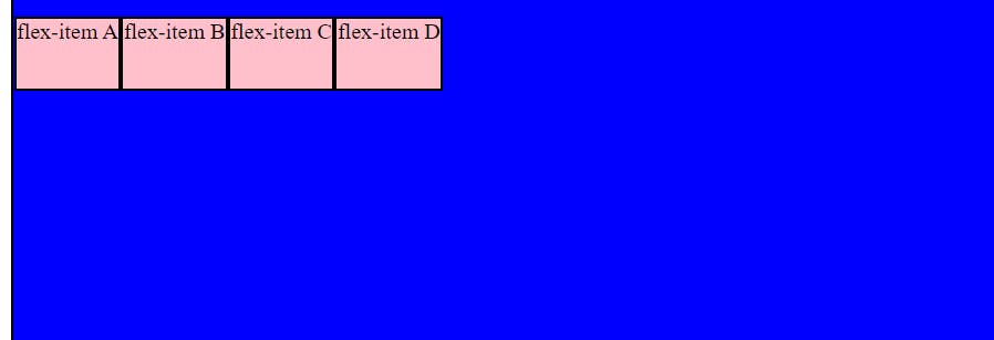
"p" is an block level element but as soon as we gave "flex-direction: row", all flex-items are arranged horizontally. Although, by default the flex-direction is set to row, so it will work even if do not provide the same (although we must set "display: flex").
In the example below, we set the "flex-direction: row-reverse"
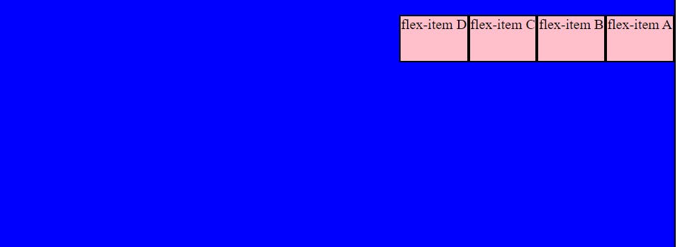
other than those depicted above, there are other flex directions as well:
     column
     column-reverse

I advise you to try these out on our own.
(1b) flex-wrap
This is a very important property which let's your web app to render on any device (laptop, iPad, phone etc.) by adjusting the flex items as per the size of the view port and prevent them from overflowing. by default flex-wrap is set to the value "nowrap".
Let's use "flex-wrap: wrap" in the below example:
<!DOCTYPE html>
<html lang="en">
<head>
    <meta charset="UTF-8">
    <meta http-equiv="X-UA-Compatible" content="IE=edge">
    <meta name="viewport" content="width=device-width, initial-scale=1.0">
    <title>Document</title>

    <style>
         div{
            background-color: blue;
            border: 2px solid black;
            height: 400px;
            display: flex;
            flex-wrap: wrap;
        }

        .child{
            background-color: pink;
            border: 2px solid black;
            height: 50px;
        }
    </style>
</head>
<body>
    <div>
        <p class="child">flex-item A</p>
        <p class="child">flex-item B</p>
        <p class="child">flex-item C</p>
        <p class="child">flex-item D</p>
    </div>
</body>
</html>
There is also "flex-wrap: wrap-reverse" in which instead of items falling below they will climb above as the view-port width decreases. Try it out.
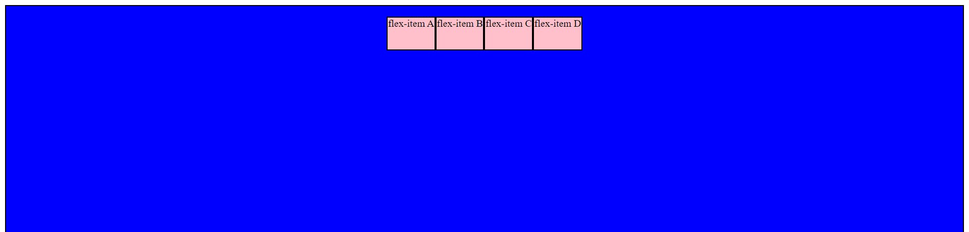
(1c) justify-content
By using justify-content, we can move the flex-items across the main axis. Default value of justify-content is flex-start. Let's use "justify-content: center" in the below example:
<!DOCTYPE html>
<html lang="en">
<head>
    <meta charset="UTF-8">
    <meta http-equiv="X-UA-Compatible" content="IE=edge">
    <meta name="viewport" content="width=device-width, initial-scale=1.0">
    <title>Document</title>

    <style>
         div{
            background-color: blue;
            border: 2px solid black;
            height: 400px;
            display: flex;
            justify-content: center;
        }

        .child{
            background-color: pink;
            border: 2px solid black;
            height: 50px;
        }
    </style>
</head>
<body>
    <div>
        <p class="child">flex-item A</p>
        <p class="child">flex-item B</p>
        <p class="child">flex-item C</p>
        <p class="child">flex-item D</p>
    </div>
</body>
</html>
Let's see the output of "justify-content: space-around"👇
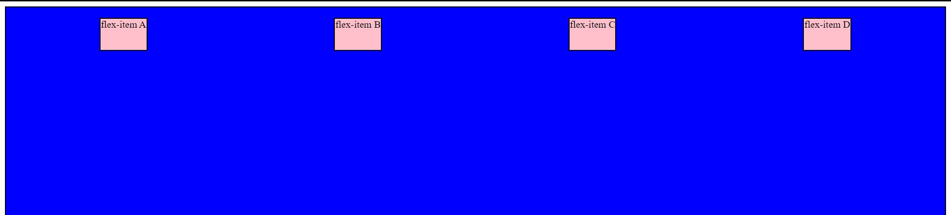
Now, I would nudge you to try out other properties of justify-content such as:
flex-start
flex-end
space-between
space-evenly
(1d) align-items:
The align-items property aligns the items inside a flex container along the cross axis just like justify-content does along the main axis. Let's see "justify-content: space-around" and "align-items: center" work together:
<!DOCTYPE html>
<html lang="en">
<head>
    <meta charset="UTF-8">
    <meta http-equiv="X-UA-Compatible" content="IE=edge">
    <meta name="viewport" content="width=device-width, initial-scale=1.0">
    <title>Document</title>

    <style>
         div{
            background-color: blue;
            border: 2px solid black;
            height: 400px;
            display: flex;
            justify-content: space-around;
            align-items: center;
        }

        .child{
            background-color: pink;
            border: 2px solid black;
            height: 50px;
        }
    </style>
</head>
<body>
    <div>
        <p class="child">flex-item A</p>
        <p class="child">flex-item B</p>
        <p class="child">flex-item C</p>
        <p class="child">flex-item D</p>
    </div>
</body>
</html>
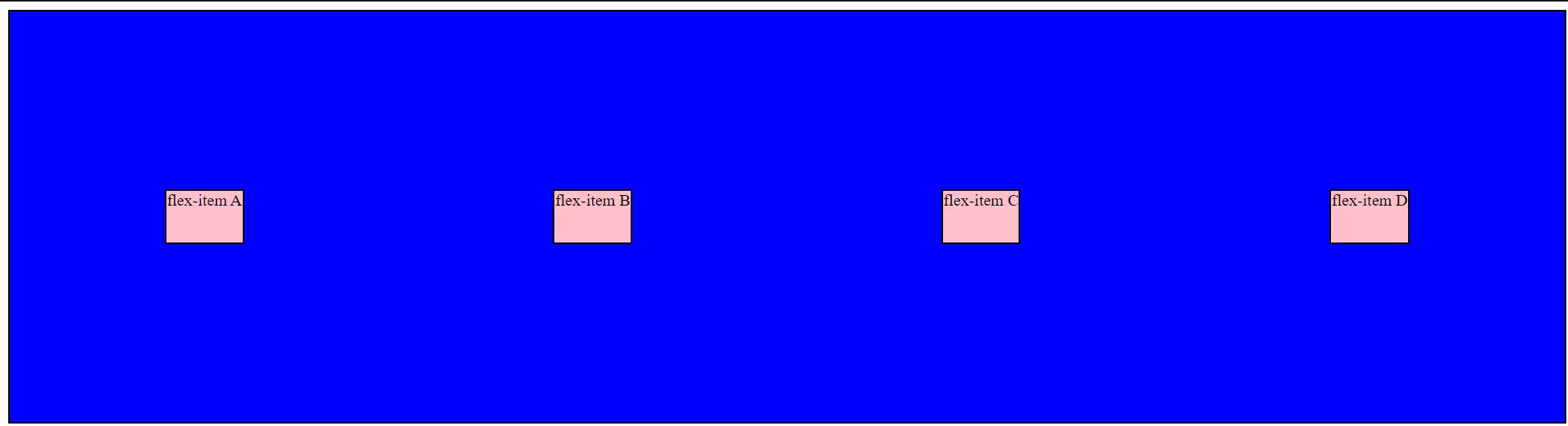
The default value of align-items is stretch which makes the flex-items stretch across the cross axis in the flex-container (However, it will work when the flex-items have not been assigned any height). Try it out.
Now, let's see how "align-items: center" works without justify-content.
<!DOCTYPE html>
<html lang="en">
<head>
    <meta charset="UTF-8">
    <meta http-equiv="X-UA-Compatible" content="IE=edge">
    <meta name="viewport" content="width=device-width, initial-scale=1.0">
    <title>Document</title>

    <style>
         div{
            background-color: blue;
            border: 2px solid black;
            height: 400px;
            display: flex;
            align-items: center;
         }

        .child{
            background-color: pink;
            border: 2px solid black;
            height: 50px;
        }
    </style>
</head>
<body>
    <div>
        <p class="child">flex-item A</p>
        <p class="child">flex-item B</p>
        <p class="child">flex-item C</p>
        <p class="child">flex-item D</p>
    </div>
</body>
</html>
Now, let's understand properties that apply on flex-items.
(2a) order
The order property is specified as a single number. We can change order of flex-items using the order property. By default, all flex-items have "order: 0". The greater the order, the farther is the element along the main axis. Let's see the below example:
<!DOCTYPE html>
<html lang="en">
<head>
    <meta charset="UTF-8">
    <meta http-equiv="X-UA-Compatible" content="IE=edge">
    <meta name="viewport" content="width=device-width, initial-scale=1.0">
    <title>Document</title>

    <style>
         div{
            background-color: blue;
            border: 2px solid black;
            height: 400px;
            display: flex;
            align-items: center;
         }

        .child{
            background-color: pink;
            border: 2px solid black;
            height: 50px;
        }

        .child:nth-child(2){
            order: 2;
        }
    </style>
</head>
<body>
    <div>
        <p class="child">flex-item A</p>
        <p class="child">flex-item B</p>
        <p class="child">flex-item C</p>
        <p class="child">flex-item D</p>
    </div>
</body>
</html>
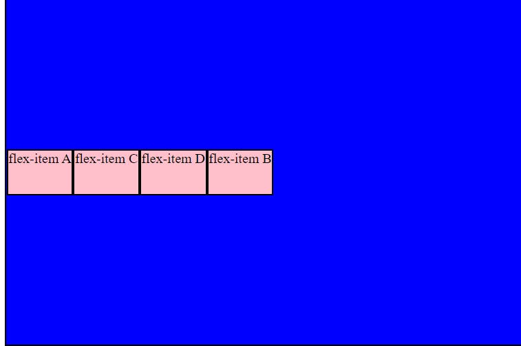
Since, we gave flex-item B "order: 2", it will be pushed to the extreme right and if some other flex-item has "order: 3", it will get stacked after flex-item B. However, there will be no effect if all flex-items have same order (does not matter if it is 2, 3 or some other number)
(2b) flex-grow
The flex-grow property is specified as a single number. flex-grow is an amazing property to have. It specifies how much of the remaining space across the main axis in the flex container should be assigned to the item (the flex grow factor).
Let's understand this with an example:
<!DOCTYPE html>
<html lang="en">
<head>
    <meta charset="UTF-8">
    <meta http-equiv="X-UA-Compatible" content="IE=edge">
    <meta name="viewport" content="width=device-width, initial-scale=1.0">
    <title>Document</title>

    <style>
         div{
            background-color: blue;
            border: 2px solid black;
            height: 400px;
            display: flex;
            align-items: center;
         }

        .child{
            background-color: pink;
            border: 2px solid black;
            height: 50px;
        }

        .child:nth-child(4){
            flex-grow: 1;
        }
    </style>
</head>
<body>
    <div>
        <p class="child">flex-item A</p>
        <p class="child">flex-item B</p>
        <p class="child">flex-item C</p>
        <p class="child">flex-item D</p>
    </div>
</body>
</html>
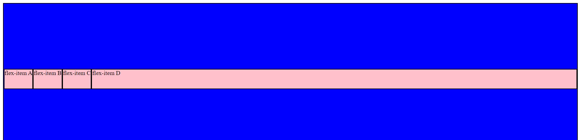
👆 Here we assigned "flex-grow: 1" to flex-item D and saw that it took all the remaining space.
If all sibling items have the same flex grow factor, then all items will receive the same share of remaining space, otherwise it is distributed according to the ratio defined by the different flex grow factors.
Let's understand this with another example:
<!DOCTYPE html>
<html lang="en">
<head>
    <meta charset="UTF-8">
    <meta http-equiv="X-UA-Compatible" content="IE=edge">
    <meta name="viewport" content="width=device-width, initial-scale=1.0">
    <title>Document</title>

    <style>
         div{
            background-color: blue;
            border: 2px solid black;
            height: 400px;
            display: flex;
            align-items: center;
         }

        .child{
            background-color: pink;
            border: 2px solid black;
            height: 50px;
        }

        .child:nth-child(4){
            flex-grow: 1;
        }

        .child:nth-child(3){
            flex-grow: 2;
        }
    </style>
</head>
<body>
    <div>
        <p class="child">flex-item A</p>
        <p class="child">flex-item B</p>
        <p class="child">flex-item C</p>
        <p class="child">flex-item D</p>
    </div>
</body>
</html>
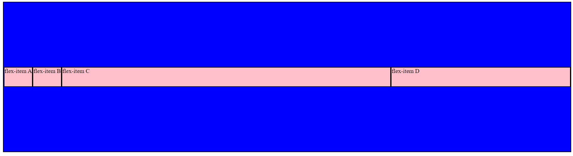
👆 Here, we assigned "flex-grow: 2" to flex-item C in addition to "flex-grow: 1" to flex-item D and saw that the remaining space gets distributed according to the ratio (C:D = 2:1) defined by the different flex grow factors.
(2c) flex-shrink
The flex-shrink property sets the flex shrink factor of a flex item. If the size of all flex items is larger than the flex container, items shrink to fit according to flex-shrink.
Unlike flex-grow which lets our flex-items behave in a certain way when screen-size (view port) increases, flex-shrink helps with the behaviour of flex-items when view-port decreases.
Let's understand with an example (We'll give "flex-shrink: 3" to flex-item C and see what happens):
<!DOCTYPE html>
<html lang="en">
<head>
    <meta charset="UTF-8">
    <meta http-equiv="X-UA-Compatible" content="IE=edge">
    <meta name="viewport" content="width=device-width, initial-scale=1.0">
    <title>Document</title>

    <style>
         div{
            background-color: blue;
            border: 2px solid black;
            height: 400px;
            display: flex;
            align-items: center;
         }

        .child{
            background-color: pink;
            border: 2px solid black;
            height: 50px;
        }

        .child:nth-child(3){
            flex-shrink: 3;
        }
    </style>
</head>
<body>
    <div>
        <p class="child">flex-item A</p>
        <p class="child">flex-item B</p>
        <p class="child">flex-item C</p>
        <p class="child">flex-item D</p>
    </div>
</body>
</html>
☝️Here, flex-shrink property sets the flex shrink factor of 3 to "flex-item C" and as a result as the screen gets smaller, the flex-item C is shrinking thrice as fast as compared to other flex-items.
I write articles related to web development. Follow me here if you are learning the same.
If you love the article follow me on Twitter: @therajatg
If you are the Linkedin type, let's connect: linkedin.com/in/therajatg
Have an awesome day ahead 😀!