


Let's see what MDN has to say about grids:
CSS Grid Layout excels at dividing a page into major regions or defining the relationship in terms of size, position, and layer, between parts of a control built from HTML primitives.
Like tables, grid layout enables an author to align elements into columns and rows. However, many more layouts are either possible or easier with CSS grid than they were with tables. For example, a grid container's child elements could position themselves so they actually overlap and layer, similar to CSS positioned elements.
Did you understand 👆?
don't worry. me neither.
Only know this: grid allow us to arrange our content efficiently using rows and columns which was used to be a headache before grid was introduced.
We'll understand the following grid properties in order:
1. grid-template-rows and grid-template-columns
2. justify-items
3. align-items
4. justify-self and align-self
5. gap
6. grid-row-start, grid-row-end and grid-row
7. grid-column-start, grid-column-end and grid-column
8. grid-template-areas and grid-areas
Note: In order to use grids we must give "display: grid" to the container.
1. grid-template-rows and grid-template-columns
grid-template-rows: This property gives the number of rows present in the grid container. Below, we are dividing our container in 4 rows and each row is having a width of 30px.
grid-template-rows: 30px 30px 30px 30px;      /*This is bulky*/

                         /*OR*/

grid-template-rows: repeat(4, 30px);                  /*I prefer this*/
grid-template-columns: you guessed it right, this property gives the number of columns present in the grid container.
grid-template-columns: 30px 30px 30px;          /*This is bulky*/

                         /*OR*/

grid-template-columns: repeat(3, 30px);            /*I prefer this*/
Let's make a 4x3 grid (that is grid having 4 rows and 3 columns):
<!DOCTYPE html>
<html lang="en">
<head>
    <meta charset="UTF-8">
    <meta http-equiv="X-UA-Compatible" content="IE=edge">
    <meta name="viewport" content="width=device-width, initial-scale=1.0">
    <title>Document</title>
    <style>
        div{
            height: 600px;
            width: 1000px;
            background-color: black;
            display: grid;
            grid-template-rows: repeat(4, 1fr);
            grid-template-columns: repeat(3, 1fr);
        }
    </style>
</head>
<body>
    <div>

    </div>
</body>
</html>
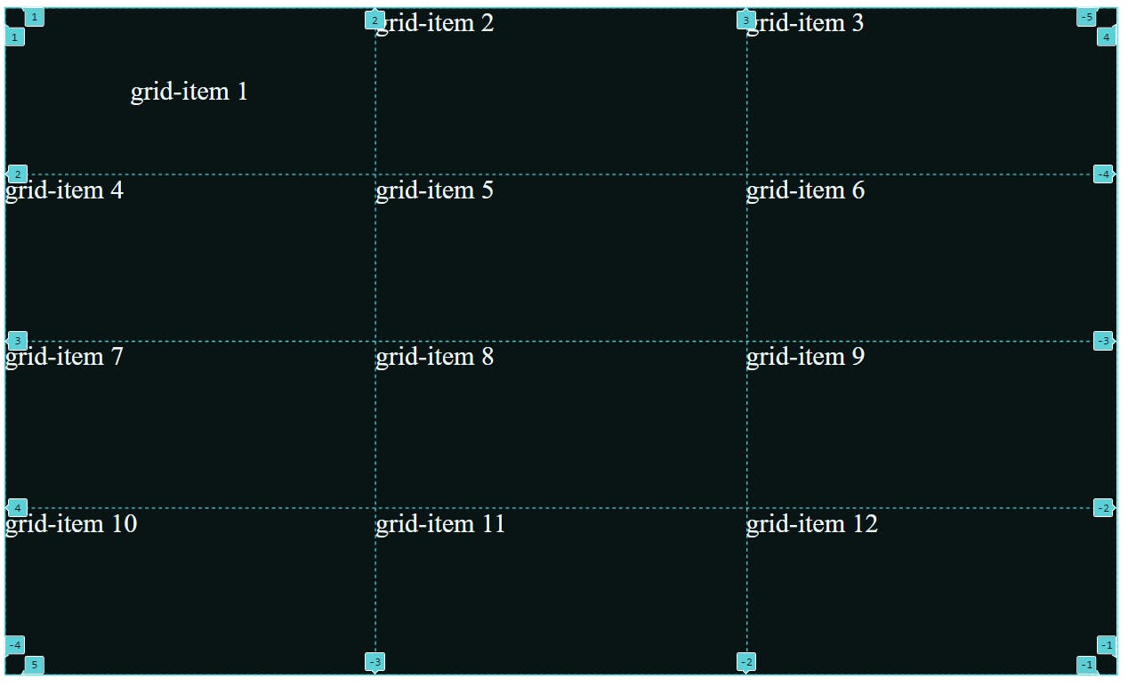
In the above code, we could have used px, rem etc. but I want you to understand the unit fr. 1fr is the 1 fraction of entire width/ height available and hence width of each of our row as well as column is 1fr and they will cover the entire container.
(I made the grid lines visible for you to understand better, by default you cannot see them)
In the above picture, you could see grid lines dividing rows as well as columns. Please note that they start from 1 (not 0).
2. justify-items
This property is used to move content horizontally in all the grid cells at once. We can set its value to "start", "center" or "end".
justify-items: center;
See👇 how the content in all of the grid cells moved to center in horizontal direction.
I think "justify-items: end" is self-explanatory (Instead of center the grid-items will move to end)
3. align-items
This property is used to move content vertically in all the grid cells at once. We can set its value to "start", "center" or "end".
justify-items: center;             /*Horizontal movement*/
align-items: center;               /*Vertical Movement*/
See👇 how the content in all of the grid cells moved to center in vertical direction too.
4. justify-self and align-self
justify-self is similar to justify-items and align-self is similar to align-items. The only difference is that both justify-items and align-items properties are applied to grid-container and justify-self and align-self applies on grid cells.
let's apply both properties on the grid-item1 (and remove properties applied in the above point)
.child:nth-child(1){
            justify-self: center;           /*horizontal movement*/
            align-self: center;             /*vertical movement*/
        }
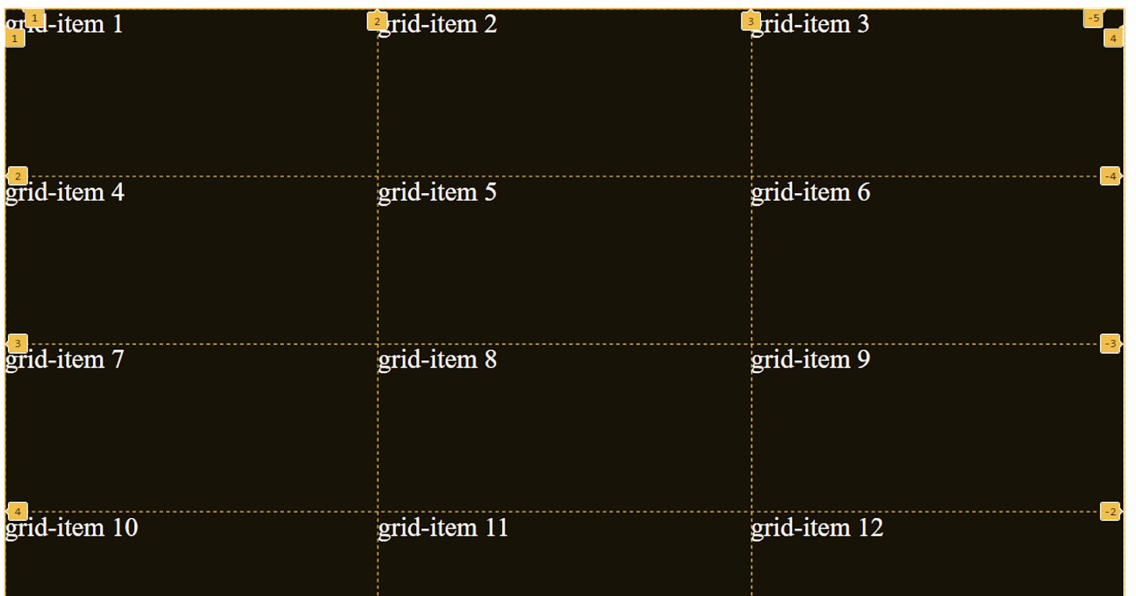
5. gap
This property is used to provide gap between grid cells. if we want gap between grid rows to be different from the gap between grid-columns then we have to use "row-gap" and "column-gap" both. It depends on the use case.
row-gap: 8px;
column-gap: 8px;

          OR

gap: 8px;
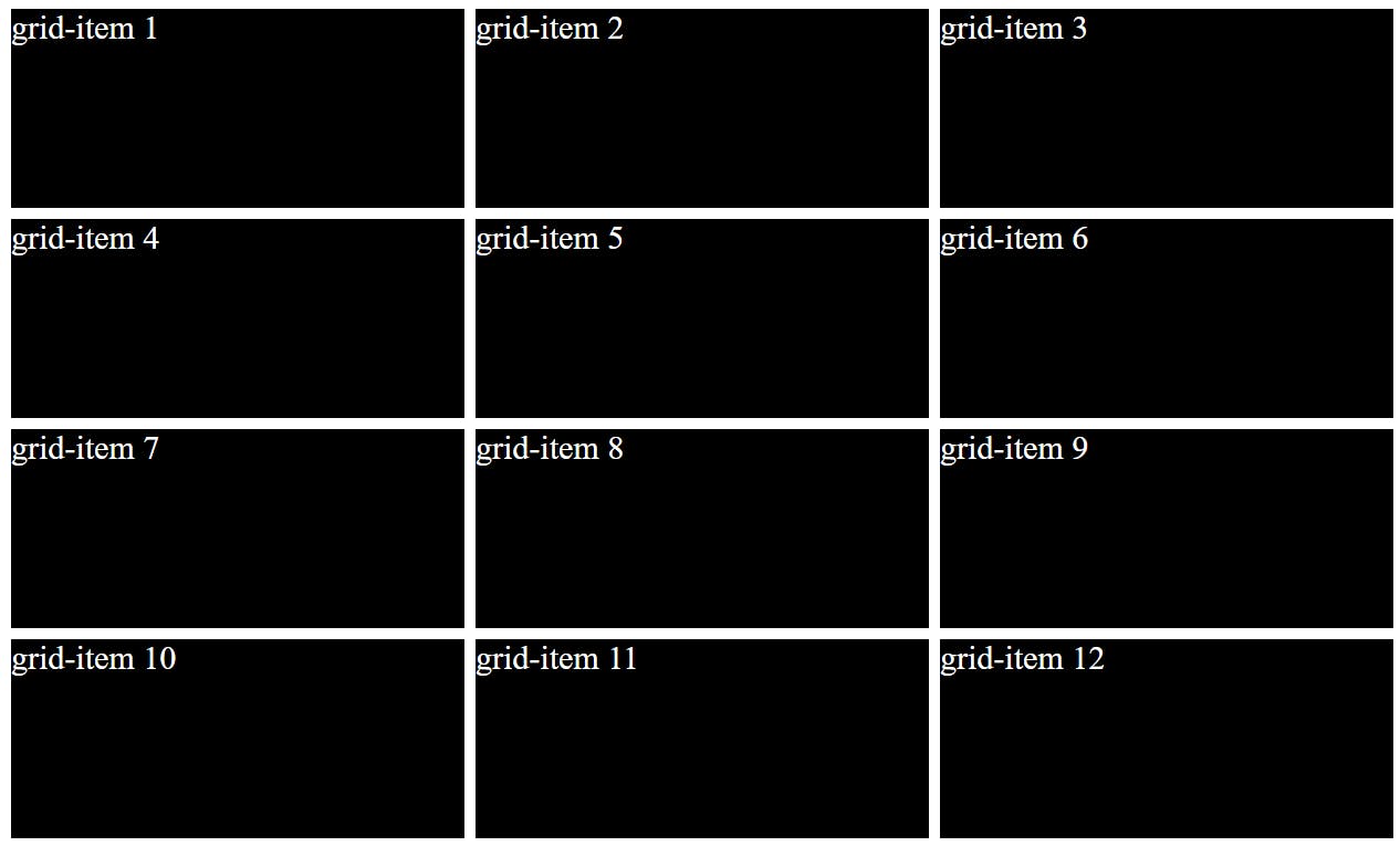
In order for gap to be clearly visible I assigned the "background-color: black" to child class and removed the "background-color" property from the container class.
<!DOCTYPE html>
<html lang="en">
<head>
    <meta charset="UTF-8">
    <meta http-equiv="X-UA-Compatible" content="IE=edge">
    <meta name="viewport" content="width=device-width, initial-scale=1.0">
    <title>Document</title>
    <style>
        .container{
            height: 600px;
            width: 1000px;
            color: white;
            font-size: 24px;
            display: grid;
            grid-template-rows: repeat(4, 1fr);
            grid-template-columns: repeat(3, 2fr);
            gap: 8px;
        }

        .child{
            background-color: black;
        }

    </style>
</head>
<body>
    <div class="container">
        <div class="child">grid-item 1</div>
        <div class="child">grid-item 2</div>
        <div class="child">grid-item 3</div>
        <div class="child">grid-item 4</div>
        <div class="child">grid-item 5</div>
        <div class="child">grid-item 6</div>
        <div class="child">grid-item 7</div>
        <div class="child">grid-item 8</div>
        <div class="child">grid-item 9</div>
        <div class="child">grid-item 10</div>
        <div class="child">grid-item 11</div>
        <div class="child">grid-item 12</div>
    </div>
</body>
</html>
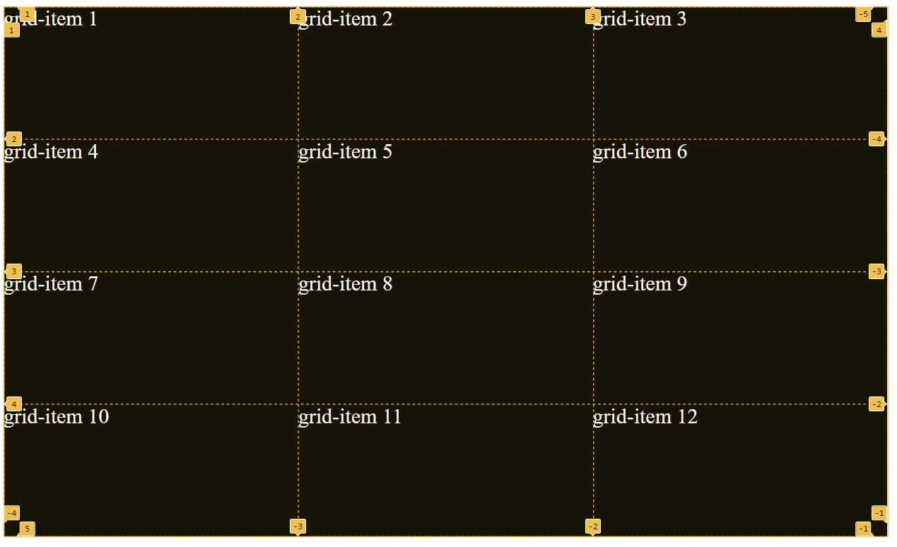
6. "grid-row-start", "grid-row-end" and "grid-row":
The grid-row property specifies a grid item's size and location in a grid layout, and is a shorthand property for grid-row-start and grid-row-end.
7. "grid-column-start", "grid-column-end" and "grid-column":
The grid-row property specifies a grid item's size and location in a grid layout, and is a shorthand property for grid-row-start and grid-row-end.
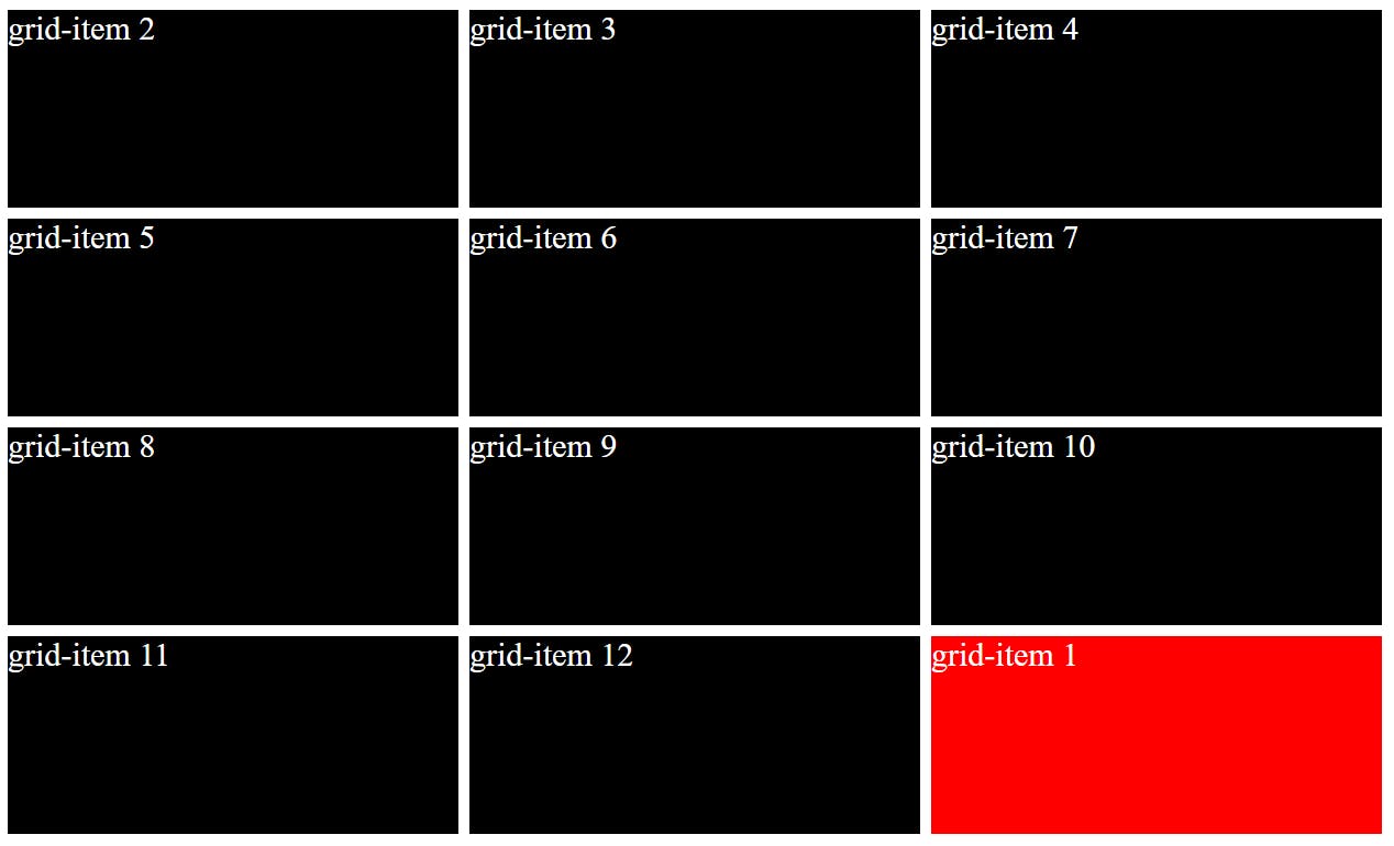
**Let's understand the above 2 properties by moving grid-item1 to the last cell (and replace grid-item 12). **
In order to clearly differentiate grid-item 1, I gave red color to it.
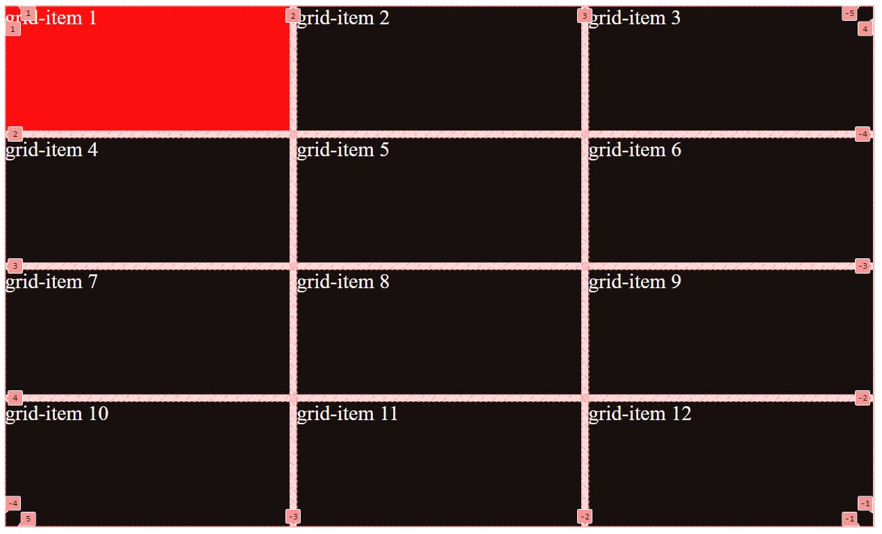
(Here I made the grid lines visible for you to understand better)
The below code-snippet when applied to any grid-item will move it between grid lines present along the rows. Here, it moves the grid-item between grid line 4 and grid line 5. However no movement will be there along the columns. you can see the numbering of grid lines in the above picture.
grid-row-start: 4;        /*This is bulky*/
grid-row-end: 5;

     /*OR*/

grid-row: 4/5              /*I like this better*/
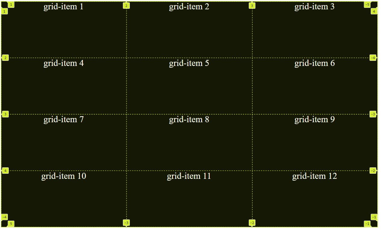
Notice that as the grid-item 1 moved from its position all grid-items moved by one position (grid-item 2 took place of grid-item 1, grid-item 3 took place of grid-item 2 and so on)
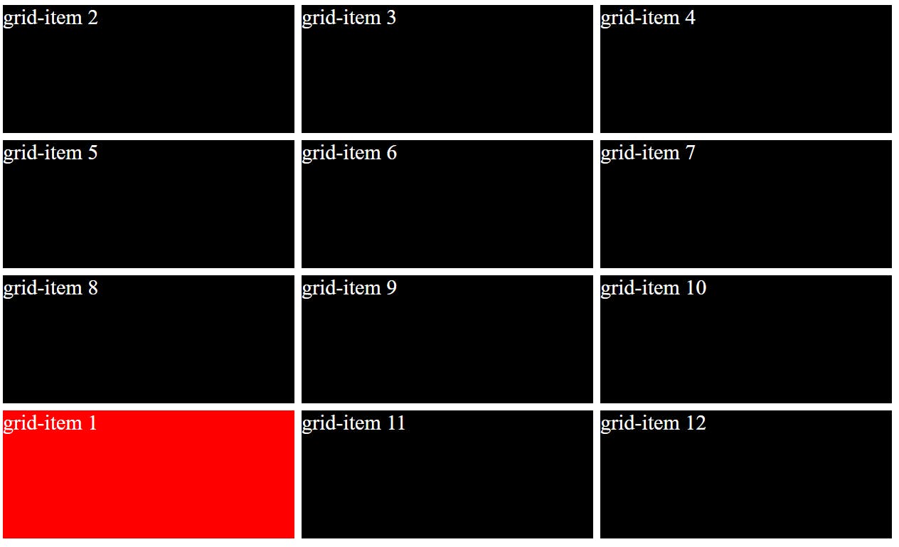
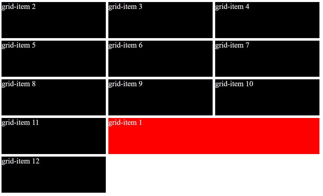
Ok, so it moved but instead of replacing grid-item 12, it replaced grid-item 10. let's try once more to move it to our desired destination:
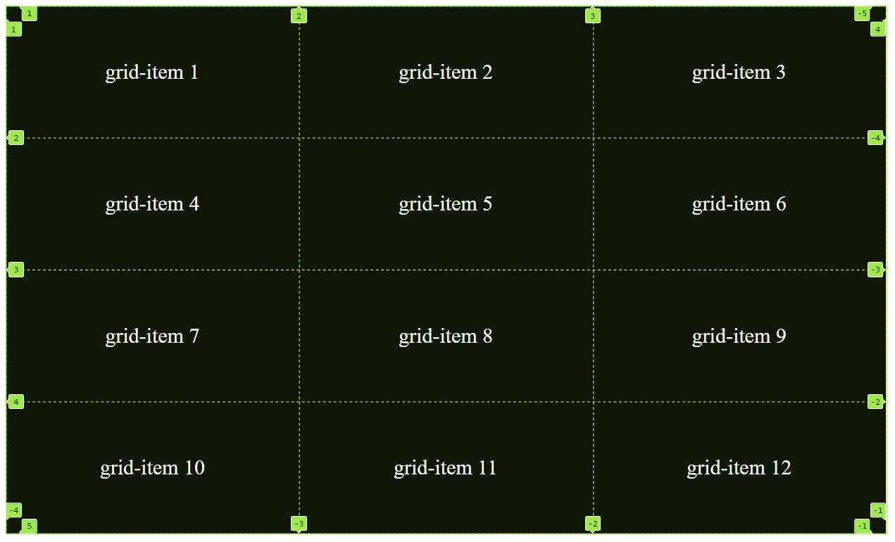
grid-column-start: 3;        /*This is bulky*/
grid-column-end: 4;

     /*OR*/

grid-column: 3/4              /*I like this better*
The above code-snippet when applied to any grid-item will move it between grid lines present along the columns. Here, it moves the grid-item between grid line 3 and grid line 4. However no movement will be there along the rows.
Hurray! we did it.
Now, to summarize, the above movement of grid-item 1 could be achieved by the below code:
.child:nth-child(1){
            background-color: red;
            grid-row: 4/5;
            grid-column: 3/4;
        }
Let's see the full HTML and CSS once:
<!DOCTYPE html>
<html lang="en">
<head>
    <meta charset="UTF-8">
    <meta http-equiv="X-UA-Compatible" content="IE=edge">
    <meta name="viewport" content="width=device-width, initial-scale=1.0">
    <title>Document</title>
    <style>
        .container{
            height: 600px;
            width: 1000px;
            color: white;
            font-size: 24px;
            display: grid;
            grid-template-rows: repeat(4, 1fr);
            grid-template-columns: repeat(3, 2fr);
            gap: 8px;
        }

        .child{
            background-color: black;
        }

        .child:nth-child(1){
            background-color: red;
            grid-row: 4/5;                        /* This is important */
            grid-column: 3/4;
        }

    </style>
</head>
<body>
    <div class="container">
        <div class="child">grid-item 1</div>
        <div class="child">grid-item 2</div>
        <div class="child">grid-item 3</div>
        <div class="child">grid-item 4</div>
        <div class="child">grid-item 5</div>
        <div class="child">grid-item 6</div>
        <div class="child">grid-item 7</div>
        <div class="child">grid-item 8</div>
        <div class="child">grid-item 9</div>
        <div class="child">grid-item 10</div>
        <div class="child">grid-item 11</div>
        <div class="child">grid-item 12</div>
    </div>
</body>
</html>
Ok, so we moved the grid-item. Now, what. Read the definition of grid-row and grid-column again. You'll see their is something written about changing the size of the grid-item. Let me change the size of grid-item 1 so that it could take the space of 2 grid cells (grid-item 11 and grid-item 12).
.child:nth-child(1){
       background-color: red;
       grid-row: 4/5;                        /* row is same */
       grid-column: 2/4;                  /*stretched along 2 columns*/
   }
Note that the last grid item moved to next row (I also added 1 more row for this by "grid-template-row: repeat(5, 1fr)").
I hope you understand "grid-row-start", "grid-row-end", "grid-row", "grid-column-start", "grid-column-end" and "grid-column". Looks like you get hang of too many properties at once.
8. "grid-template-areas" and "grid-areas"
These 2 are awesome properties which helps us build amazing layouts without any headaches. We'll understand these 2 by making the below layout:
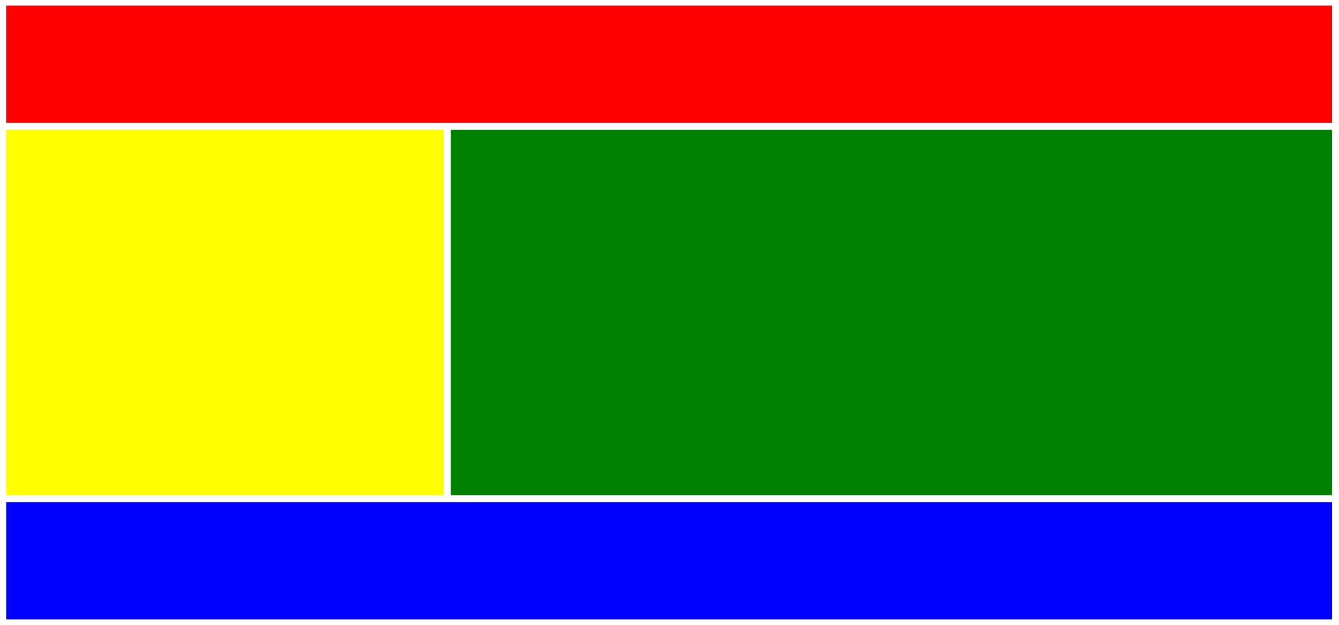
Let's first make the above layout by using the properties we just learnt.
<!DOCTYPE html>
<html lang="en">
<head>
    <meta charset="UTF-8">
    <meta http-equiv="X-UA-Compatible" content="IE=edge">
    <meta name="viewport" content="width=device-width, initial-scale=1.0">
    <title>Document</title>
    <style>
        body{
            display: grid;
            grid-template-columns: repeat(3, 1fr);
            grid-template-rows: repeat(5, 1fr);
            height: 44rem;
            gap: 8px;
        }

        div:nth-child(1){
            background-color: red;
            grid-column: 1/4;
        }
        div:nth-child(2){
            background-color: yellow;
            grid-row: 2/5;
        }
        div:nth-child(3){
            background-color: green;
            grid-column: 2/4;
            grid-row: 2/5;
        }
        div:nth-child(4){
            background-color: blue;
            grid-column: 1/4;
            grid-row: 5/6;
        }
    </style>
</head>
<body>
    <div class="header"></div>
    <div class="sidebar"></div>
    <div class="content"></div>
    <div class="footer"></div>
</body>
</html>
"grid-template-area" defines a grid template by referencing the names of the grid areas which are specified with the grid-area property. Repeating the name of a grid area causes the content to span those cells. The syntax itself provides a visualization of the structure of the grid.
Now, let's make the above layout using "grid-template-area" and "grid-area" property.
<!DOCTYPE html>
<html lang="en">
<head>
    <meta charset="UTF-8">
    <meta http-equiv="X-UA-Compatible" content="IE=edge">
    <meta name="viewport" content="width=device-width, initial-scale=1.0">
    <title>Document</title>
    <style>
        body{
            display: grid;
            grid-template-areas:
            'header header header'
            'sidebar content content'
            'sidebar content content'
            'sidebar content content'
            'footer footer footer';
            height: 44rem;
            gap: 8px;
        }

        div:nth-child(1){
            background-color: red;
            grid-area: header;
        }
        div:nth-child(2){
            background-color: yellow;
            grid-area: sidebar;
        }
        div:nth-child(3){
            background-color: green;
            grid-area: content;
        }
        div:nth-child(4){
            background-color: blue;
            grid-area: footer;
        }

    </style>
</head>
<body>
    <div class="header"></div>
    <div class="sidebar"></div>
    <div class="content"></div>
    <div class="footer"></div>
</body>
</html>
You must be thinking as how cool it is. 🤘yes! I know.
Note: In div:nth-child(), we could give any value to "grid-area" and it will work fine as long as same value is referenced in "grid-template-areas", see the below styling of body and div:nth-child() to understand more:
body{
            display: grid;
            grid-template-areas:
            'h h h'
            's c c'
            's c c'
            's c c'
            'f f f';
            height: 44rem;
            gap: 8px;
        }

        div:nth-child(1){
            background-color: red;
            grid-area: h;
        }
        div:nth-child(2){
            background-color: yellow;
            grid-area: s;
        }
        div:nth-child(3){
            background-color: green;
            grid-area: c;
        }
        div:nth-child(4){
            background-color: blue;
            grid-area: f;
        }
If you are still with me, you must have realized that grids are insanely powerful and you can use them to make complex layouts.
I hope the above article about grids added some value.
I write articles related to web development. Follow me here if you are learning the same.
If you love the article follow me on Twitter: @therajatg
If you are the Linkedin type, let's connect: linkedin.com/in/therajatg
Have an awesome day ahead 😀!