


Let's see what MDN has to say: The opacity CSS property sets the opacity of an element. Opacity is the degree to which content behind an element is hidden, and is the opposite of transparency.
Here are few important points to note:
Value of opacity ranges from 0 to 1 where 1 signifies that our element is fully opaque and 0 signifies that our element is transparent. Hence, opacity decreases as we move from 1 to 0.
Default value of opacity is 1.
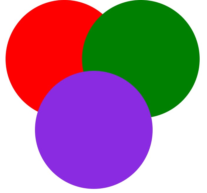
Let's understand it with some examples:
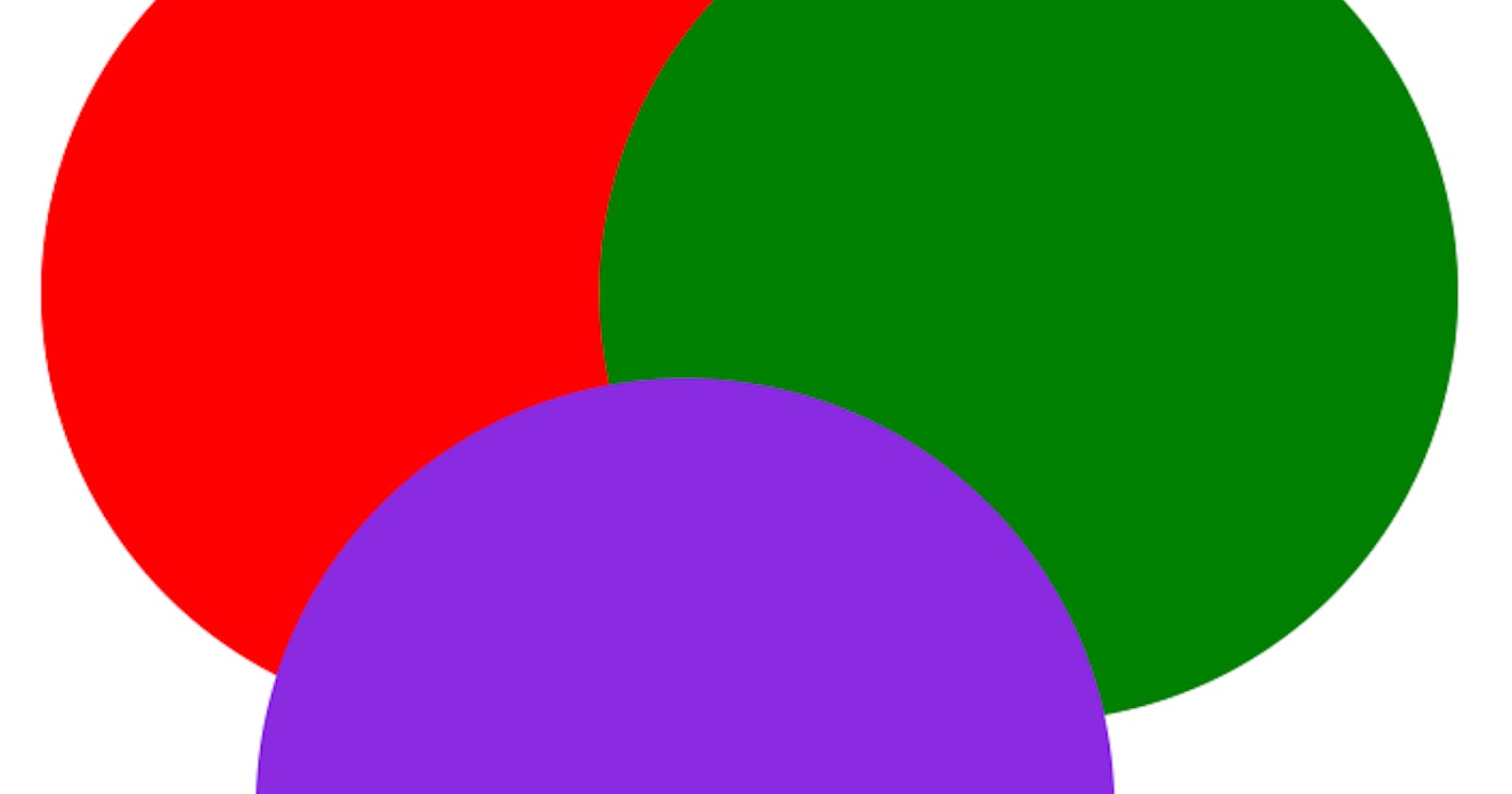
<!DOCTYPE html>
<html lang="en">
<head>
    <meta charset="UTF-8">
    <meta http-equiv="X-UA-Compatible" content="IE=edge">
    <meta name="viewport" content="width=device-width, initial-scale=1.0">
    <title>Document</title>
    <style>
        #red{
            background-color: red;
            height: 10rem;
            width: 10rem;
            border-radius: 5rem;
            top: 0rem;
            position: absolute;
        }
        #green{
            background-color: green;
            height: 10rem;
            width: 10rem;
            border-radius: 5rem;
            position: absolute;
            top: 0rem;
            left: 7rem;
        }
        #violet{
            background-color: blueviolet;
            height: 10rem;
            width: 10rem;
            border-radius: 5rem;
            position: absolute;
            top: 6rem;
            left: 3rem;
        }
    </style>
</head>

<body>
    <div id="red"></div>
    <div id="green"></div>
    <div id="violet"></div>
</body>
</html>
Example 1: Now, let's give "opacity: 0.6" to the green circle and see what happens:
#green{
            background-color: green;
            height: 10rem;
            width: 10rem;
            border-radius: 5rem;
            position: absolute;
            top: 0rem;
            left: 7rem;
            opacity: 0.6
         }
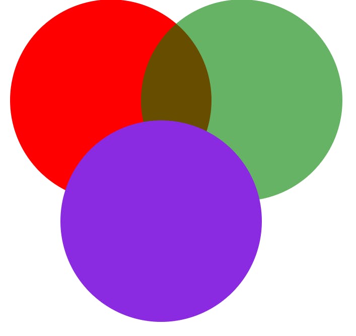
We can see that the green circle has become lighter and the red circle is visible through it.
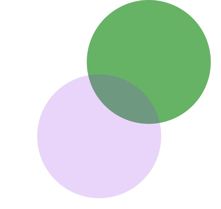
Example 2: Now, let's give "opacity: 0.2" to the violet circle and see what happens:
#violet{
            background-color: blueviolet;
            height: 10rem;
            width: 10rem;
            border-radius: 5rem;
            position: absolute;
            top: 6rem;
            left: 3rem;
            opacity: 0.2;
        }

We can barely see the violet circle and clearly see the red and green circles through it.
Example 3: Now, let's give "opacity: 0" to the red circle and see what happens:
#red{
            background-color: red;
            height: 10rem;
            width: 10rem;
            border-radius: 5rem;
            top: 0rem;
            position: absolute;
            opacity: 0;
    }
As expected we cannot see the red circle at all.
Hope you understood the opacity property in css.
We'll not have any problem if we don't have to write any text over the elements having opacity property. Although if we want to have text in the elements having opacity property, the text will also become transparent along with the element. I will tackled this problem in my next blog here.
I write articles related to web development. Follow me here if you are learning the same.
Have an awesome day ahead 😀!
my twitter handle: @therajatg
If you are the linkedin type, let's connect: linkedin.com/in/therajatg