


**The object-fit CSS property sets how the content which includes images, videos and other embedded media formats should be resized to fit its container. **
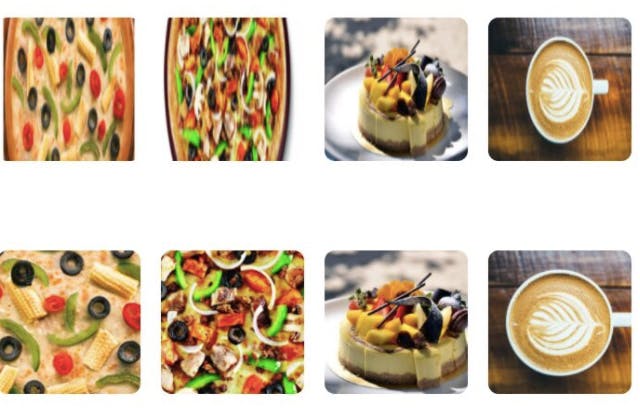
In the 👇 image, the object fit property is applied to the lower row.
Let's get the ball rolling.
object-fit has one of these five values:
1. fill
2. contain
3. cover
4. none
5. scale-down
In order to understand the above values one by one, we'll use the following code throughout the article:
<!DOCTYPE html>
<html lang="en">
<head>
    <meta charset="UTF-8">
    <meta http-equiv="X-UA-Compatible" content="IE=edge">
    <meta name="viewport" content="width=device-width, initial-scale=1.0">
    <title>Document</title>
    <style>
        img{
            height: 120px;
            width: 400px;
            background-color: skyblue;
        }
    </style>
</head>

<body>
    <img src="cycling is meditation.jpg" alt="">
</body>
</html>
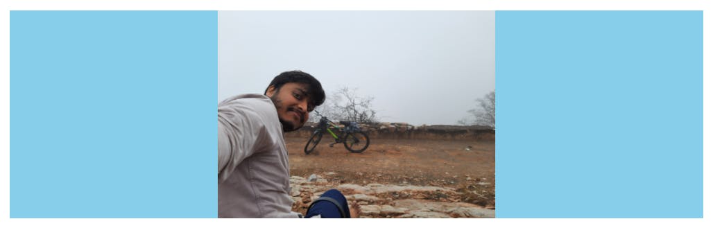
I gave the background-color property to understand better.
1. fill
This is the default value of object-fit and here our image will stretch or squeeze to fill up the container.
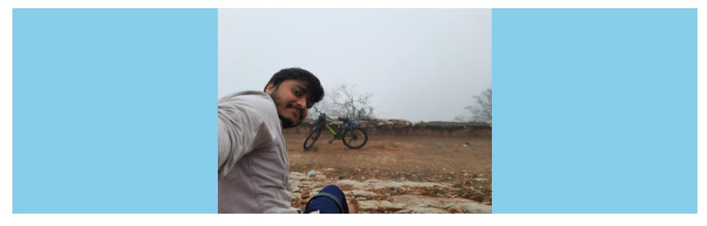
2. contain
This property maintains the aspect ratio. Our image will be inside the container but in order to maintain the aspect ratio it may or may not fill the container.
 img{
            height: 120px;
            width: 400px;
            background-color: skyblue;
            object-fit: contain;
        }
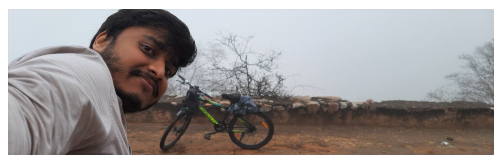
3. cover
This is the most popular value of object-fit. Here the aspect ratio is maintained and the container is also fully filled but in order to do so our image is clipped. This value works well when we are making responsive websites.
 img{
            height: 120px;
            width: 400px;
            background-color: skyblue;
            object-fit: cover;
        }
Well, frankly the last 2 are of no use. If you wanna leave, just follow me here and leave.
4. none
This value of object-fit displays the image in its original size. I told you its useless.
 img{
            height: 120px;
            width: 400px;
            background-color: skyblue;
            object-fit: none;
        }
5. scale-down
The image is sized as if none or contain both were specified, whichever would result in a smaller concrete object size will be applied.
If you have any doubt ask me in the comments section and I'll try to answer as soon as possible.
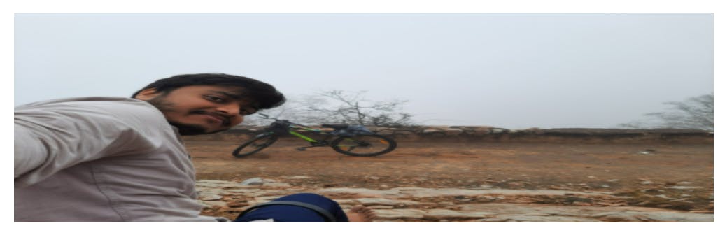
PS: The image is mine and I love long distance cycling.
I write articles related to web development. Follow me here if you are learning the same.
my twitter handle: @therajatg
If you are the linkedin type, let's connect: linkedin.com/in/therajatg
Have an awesome day ahead 😀!