


The CSS position property is used to set position for an element. So without further ado, let's get the party started.
There are 5 types of positioning:
Static Positioning
Relative Positioning
Absolute Positioning
Fixed Positioning
Sticky Positioning
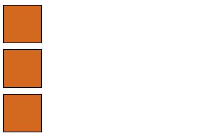
(1) Static Positioning
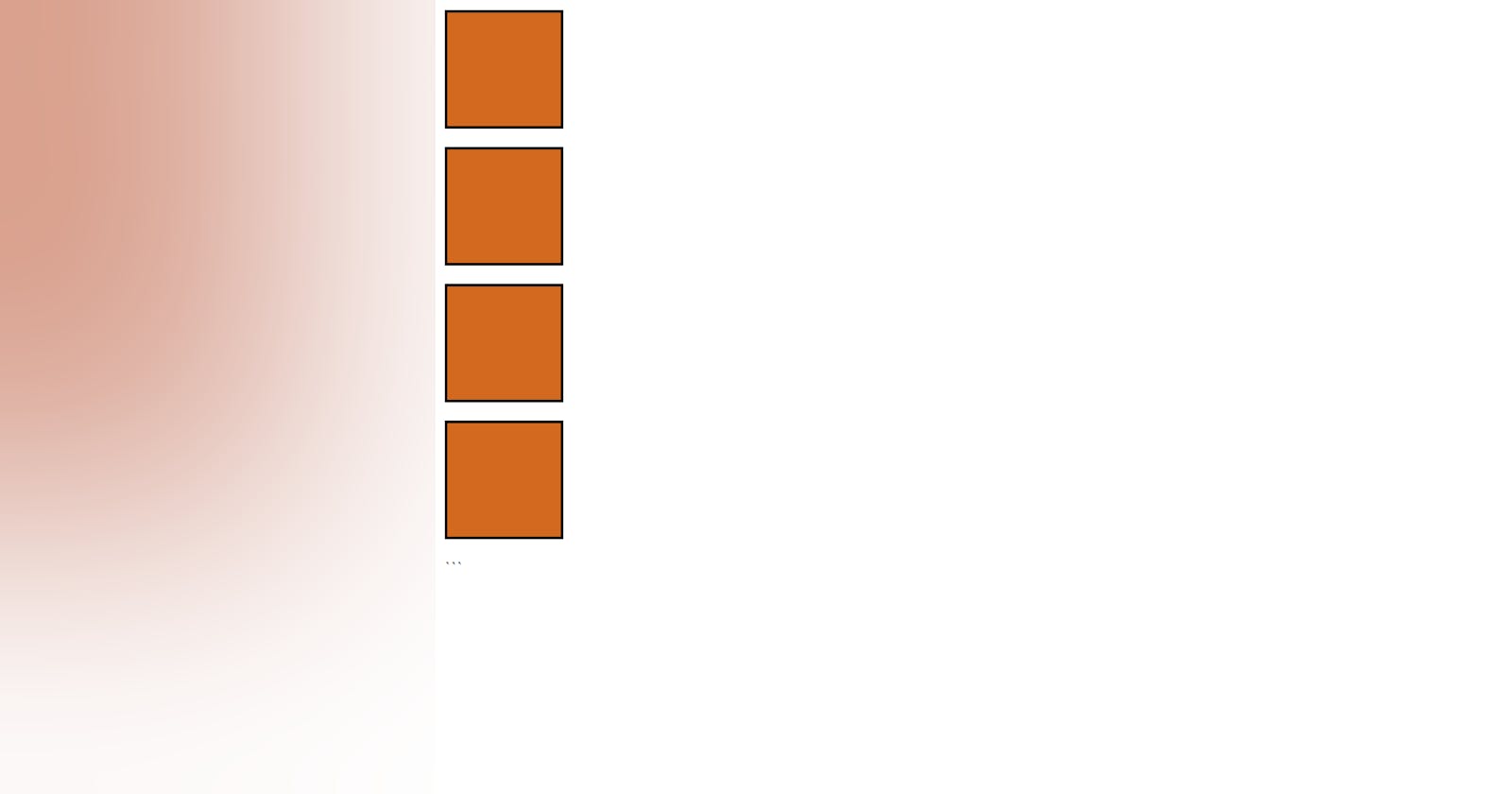
The below code will not change anything as by default position is set to “static” and since, the "p" is a block element, each box covers the entire row and the next box appears in the next row.
<!DOCTYPE html>
<html lang="en">
<head>
    <meta charset="UTF-8">
    <meta http-equiv="X-UA-Compatible" content="IE=edge">
    <meta name="viewport" content="width=device-width, initial-scale=1.0">
    <title>Document</title>
    <style>
        .box{
        width: 100px;
        height: 100px;
        border-style: solid;
        border-color: black;
        background-color: chocolate;
        position: static;
        }

        #box4{
            left: 100px;
        }
    </style>
</head>
<body>
    <p class="box" id="box1"></p>
    <p class="box" id="box2"></p>
    <p class="box" id="box3"></p>
    <p class="box" id="box4"></p>
</body>
</html>
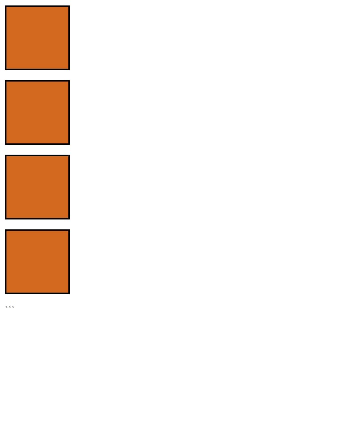
(2) Relative positioning
In order for the relative positioning to work we have to use top, bottom, left and right properties. For example, in the code below I used the “left” property on box4 and as a result the box4 left a margin of 100px from its left.
<!DOCTYPE html>
<html lang="en">
<head>
    <meta charset="UTF-8">
    <meta http-equiv="X-UA-Compatible" content="IE=edge">
    <meta name="viewport" content="width=device-width, initial-scale=1.0">
    <title>Document</title>
    <style>
        .box{
        width: 100px;
        height: 100px;
        border-style: solid;
        border-color: black;
        background-color: chocolate;
        }

        #box4{
            left: 100px;
            position: relative;
        }
    </style>
</head>
<body>
    <p class="box" id="box1"></p>
    <p class="box" id="box2"></p>
    <p class="box" id="box3"></p>
    <p class="box" id="box4"></p>
</body>
</html>
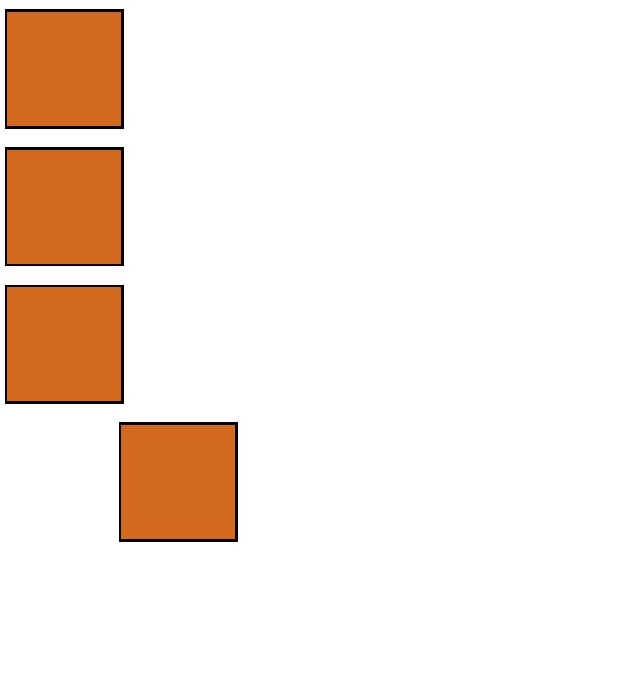
We can also merge 2 boxes together using this property. for example if I set “bottom” to 100px for box 4, it will be leave a margin of 100 px from bottom side and gets merged with box3 (It won’t get overlapped properly since there is margin between box3 and box4).
<!DOCTYPE html>
<html lang="en">
<head>
    <meta charset="UTF-8">
    <meta http-equiv="X-UA-Compatible" content="IE=edge">
    <meta name="viewport" content="width=device-width, initial-scale=1.0">
    <title>Document</title>
    <style>
        .box{
        width: 100px;
        height: 100px;
        border-style: solid;
        border-color: black;
        background-color: chocolate;
        }

        #box4{
            bottom: 100px;
            position: relative;
        }
    </style>
</head>
<body>
    <p class="box" id="box1"></p>
    <p class="box" id="box2"></p>
    <p class="box" id="box3"></p>
    <p class="box" id="box4"></p>
</body>
</html>
(3) Absolute positioning
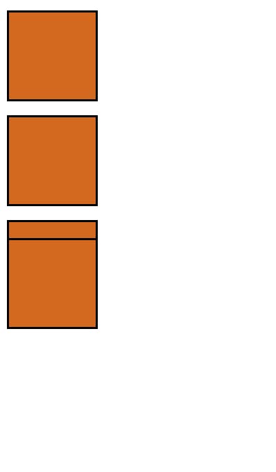
We saw in relative positioning that the element is moving relative to its current document flow. However, in absolute positioning the document flow no longer exists and the element moves either relative to the sides of body or immediate parent element. This is very useful: it means that we can create isolated UI features that don't interfere with the layout of other elements on the page such as popup information boxes, control menus etc. Now, first let's understand how it moves relative to body in absolute positioning. In the below example, box4 will merge with box1 as the distance of box4 from parent element that is body is 0px from top, which is same as box1. While overlapping, the element which is positioned win over the non positioned element.
<!DOCTYPE html>
<html lang="en">
<head>
    <meta charset="UTF-8">
    <meta http-equiv="X-UA-Compatible" content="IE=edge">
    <meta name="viewport" content="width=device-width, initial-scale=1.0">
    <title>Document</title>
    <style>
        .box{
        width: 200px;
        height: 200px;
        border-style: solid;
        border-color: black;
        background-color: chocolate;
        }

        #box4{
            position: absolute;
            top: 0px;
        }
    </style>
</head>
<body>
    <p class="box" id="box1"></p>
    <p class="box" id="box2"></p>
    <p class="box" id="box3"></p>
    <p class="box" id="box4"></p>
</body>
</html>
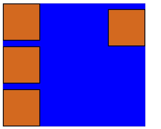
Now, let's understand how the element moves relative to immediate parent. In order for our element to move relative to the parent element other than body, we have to give parent element "position: relative" otherwise by default it will move relative to body only. In the below code we made div as parent element which contain all these boxes and moved box4 0px from right side of div.
<!DOCTYPE html>
<html lang="en">
<head>
    <meta charset="UTF-8">
    <meta http-equiv="X-UA-Compatible" content="IE=edge">
    <meta name="viewport" content="width=device-width, initial-scale=1.0">
    <title>Document</title>
    <style>
        .box{
        width: 100px;
        height: 100px;
        border-style: solid;
        border-color: black;
        background-color: chocolate;
        }

        #box4{
            position: absolute;
            top: 0px;
            right: 0px;
        }

        div{
            background-color: blue;
            width: 400px;
            position: relative;
        }
    </style>
</head>
<body>
    <div>
    <p class="box" id="box1"></p>
    <p class="box" id="box2"></p>
    <p class="box" id="box3"></p>
    <p class="box" id="box4"></p>
    </div>

</body>
</html>
Now, I want you to try moving box4 without giving "position: relative" to div in your code editor. and you'll see it is still moving relative to body. Just try it out.
Remember this: In case of relative, the element moves relative to the normal flow and in case of absolute, it moves relative to the sides of body or parent element which contains it.
(4) Fixed Positioning
Here the position of the element is fixed relative to the browser window. That means, it does not matter how much we scroll, the element will remain fixed.
This means that you can create useful UI items that are fixed in place, like persistent navigation menus that are always visible no matter how much the page scrolls.
<!DOCTYPE html>
<html lang="en">
<head>
    <meta charset="UTF-8">
    <meta http-equiv="X-UA-Compatible" content="IE=edge">
    <meta name="viewport" content="width=device-width, initial-scale=1.0">
    <title>Document</title>
    <style>
        .box{
        width: 100px;
        height: 100px;
        border-style: solid;
        border-color: black;
        background-color: chocolate;
        }

        #box4{
            position: fixed;
            top: 0px;
            left: 150px;
        }

        div{
            background-color: blue;
            height: 5000px;
        }
    </style>
</head>
<body>
    <div>
    <p class="box" id="box1"></p>
    <p class="box" id="box2"></p>
    <p class="box" id="box3"></p>
    <p class="box" id="box4"></p>
    </div>

</body>
</html>
As you can see below, we are scrolling down but box4 is fixed at the top.
(5)Sticky Positioning:
There is another position value available called “sticky”, which is somewhat newer than the others. This is basically a hybrid between relative and fixed position. It allows a positioned element to act like it's relatively positioned until it's scrolled to a certain threshold, after which it becomes fixed.
Sticky positioning can be used, for example, to cause a navigation bar to scroll with the page until a certain point and then stick to the top of the page.
It’s a bit tricky. Let’s understand it with an example:
<!DOCTYPE html>
<html lang="en">
<head>
    <meta charset="UTF-8">
    <meta http-equiv="X-UA-Compatible" content="IE=edge">
    <meta name="viewport" content="width=device-width, initial-scale=1.0">
    <title>Document</title>
    <style>
        .box{
        width: 100px;
        height: 100px;
        border-style: solid;
        border-color: black;
        background-color: chocolate;
        }

        #box4{
            position: sticky;
            top: 0px;
            left: 150px;
        }

        div{
            background-color: blue;
            height: 5000px;
        }
    </style>
</head>
<body>
    <div>
    <p class="box" id="box1"></p>
    <p class="box" id="box2"></p>
    <p class="box" id="box3"></p>
    <p class="box" id="box4"></p>
    </div>

</body>
</html>
In the above example, we replaced “fixed” with “sticky” and can see that the box is positioned 0px from top and rather then moving relative to the visible window, it moved relative to its actual flow. However, as we scrolled down it got stuck relative to browser window, no matter how low we scroll, it will be fixed there.
I write articles related to web development. Follow me here if you are learning the same.
If you love the article follow me on Twitter: @therajatg
If you are the Linkedin type, let's connect: linkedin.com/in/therajatg
Have an awesome day ahead 😀!