


Note: This is the second part of a 4 part series dedicated to the transform property of CSS.
In this part, we'll understand the value 'scale' of the transform property but if you want to jump to any other function of the transform property, be my guest and click on the links provided below:
part 1: rotate
part 2: scale
part 3: translate
part 4: skew (yet to be published)
Let's get started:
Let's see what MDN has to say: The scale() CSS function defines a transformation that resizes an element on the 2D plane. Because the amount of scaling is defined by a vector, it can resize the horizontal and vertical dimensions at different scales. Its result is a data type.
The scale() is used to scale (increase and decrease both) the length of an element across the X, Y, and Z-axis but since here we are dealing with 2D objects, I'll show you how to scale elements in the x and y direction using this property.
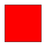
Let's make a red div (or box) to understand the scale() in transform:
 div{
            height: 100px;
            width: 100px;
            background-color: red;
            border: 1px solid black;
        }
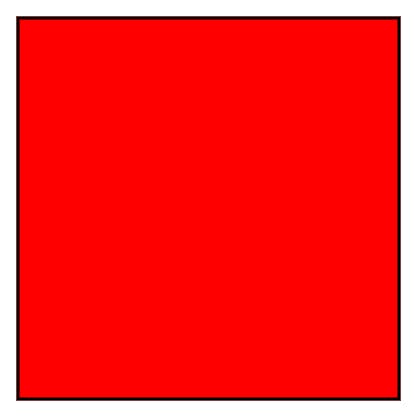
- In the below example we applied (transform: scale(3)) on the div and length of the box across both x and y-axis has become 3 times the previous length.
div{
            height: 100px;
            width: 100px;
            background-color: red;
            border: 1px solid black;
            transform: scale(3);
        }
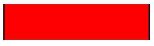
- Instead of giving only one value (transform: scale(3)), we can provide two values one for the x-axis and another one for the y-axis. see the example below:
div{
            height: 100px;
            width: 100px;
            background-color: red;
            border: 1px solid black;
            transform: scale(4, 0.5);
        }

☝️Here, the length of the box along the x-axis has become 4 times and it has halved along the y-axis.
- If we want to scale length only across one direction we can use either scaleX or scaleY (depending on the direction we want to scale)
div{
            height: 100px;
            width: 100px;
            background-color: red;
            border: 1px solid black;
            transform: scaleX(4)
        }
☝️ here the length along the x-axis has become 4 times the previous length. However, there is no change across the y-axis.
Frankly, the scale() function is quite straightforward but if you still have any doubt, feel free to ask in the comments section and do not forget to check other functions of transform (link at the top).
I write articles related to web development. Follow me here if you are learning the same.
my Twitter handle: @therajatg
If you are the Linkedin type, let's connect: linkedin.com/in/therajatg
Have an awesome day ahead 😀!