


Note: This is the third part of a 4 part series dedicated to the transform property of CSS.
In this part, we'll understand the 'translate()' function of the transform property but if you want to jump to any other function of the transform property, be my guest and click on the links provided below:
part 1: rotate
part 2: scale
part 3: translate
part 4: skew (yet to be published)
Now, this is what I feel is by far the most useful function of the transform property. It makes the moving of elements seamless. It is used to move an element left and right along the x-axis, up and down along the y-axis, and back and forth along the z-axis. Since we are dealing with 2d objects, we'll restrict ourselves along the x and y-axis.
So, let's get started:
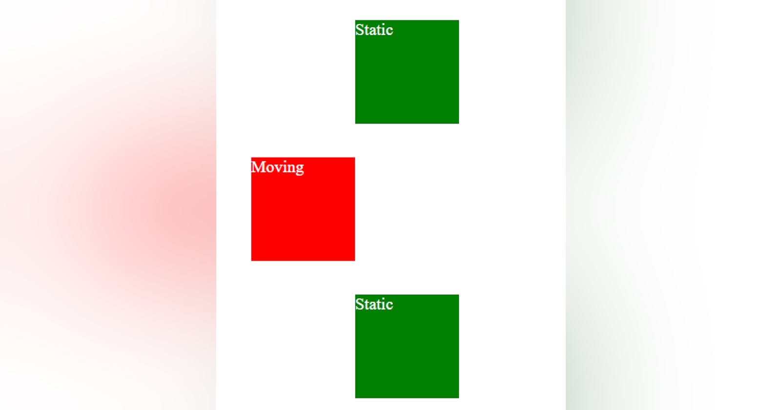
To understand this we'll take 3 boxes so that we can see the relative movement of one of the boxes (CSS is sometimes hard to teach in an article).
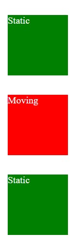
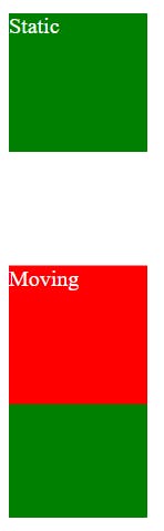
- In the below example we applied "transform: translate(50px)" to the red box and it moved 50px to its right along the x-axis.
.red{
            background-color: red;
            color: white;
            height: 100px;
            width: 100px;
            transform: translate(50px);
        }
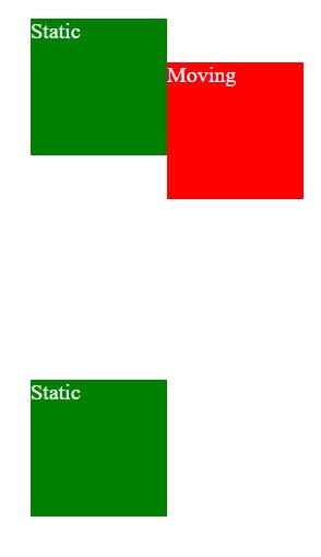
Instead of px, we can use any other unit. However, I like to use percentages here as we do not have to know the exact width of the box to move it. see the below example in which we'll move the red box by 100% (of its width) to the left.
.red{
            background-color: red;
            color: white;
            height: 100px;
            width: 100px;
            transform: translate(-100%);
        }
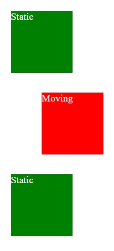
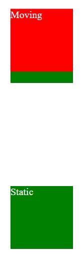
- Now, let us move the box along y-axis. Remember that the positive y will move our box downwards and negative y will move it upwards. let's see the below example:
  .red{
            background-color: red;
            color: white;
            height: 100px;
            width: 100px;
            transform: translate(0, 50%);
        }
- Now, let us move the red box 100% across both the axis (x and y):
.red{
            background-color: red;
            color: white;
            height: 100px;
            width: 100px;
            transform: translate(100%, -100%);
        }
- If we want to move across only one direction we can also use either translateX or translateY (depending on the direction we want to move) instead of what we learned above.
.red{
            background-color: red;
            color: white;
            height: 100px;
            width: 100px;
            transform: translateY(-150%);
        }
If you still have any doubt, feel free to ask in the comments section, and do not forget to check other functions of transform (link at the top).
I write articles related to web development. Follow me here if you are learning the same.
my Twitter handle: @therajatg
If you are the Linkedin type, let's connect: linkedin.com/in/therajatg
Have an awesome day ahead 😀!
PS: Whoa! I am getting good at blogging. I wrote this article in under 1.5 hours.